Concept - Close-Up
Friday, 10 May 2013
Wednesday, 8 May 2013
Guide To My Photos
The main subject is nature which fits into the exhibition category, I chose this photo of a flower to evaluate. It is a close up of a flower but this photo is quite interesting because of the quality of the photo, the close-up and it's colour. This photo has a couple of textures and patterns, and also has a few lines. The colour of the flower makes it stand out from the background because it is brighter and the brightness/colour makes it stand out. I took this picture of this flower because i liked the detail of the flower, and the colour also. It shows the beauty of nature, and just caught my attention with the colour. There is no other subject in this photo other than the flower, so it is obvious what the subject is, it is in the centre of the picture, therefore referring the the rule of thirds it is a center image. The photo could be improved by having the subject slightly to the left or slightly to the right, or a change of colour or contrast could make it more interesting and lively.A couple of people liked my photo because of the detail and also liked the fact it's a detailed close-up of the flower, also other than the detail they agreed and liked the colour's in this photo. But on the other hand, other people said the photo could of been more interesting if there was a bit more going on in the photo but not too much. Overall some people think it is a good photo but others think it could be better.
This is a professional photo of the same subject as i am doing, but this photo is a bit more interesting because the subject is to the right. Also there is more going on in the photo other than just a picture of a flower, there is a wasp/insect on the flower which makes it a bit more exciting. But compared to my photo, my photo has more detail. I like the blurred background in the professional photo, but i prefer the detailed background of my photo. My photo would of been better if it was detailed but a brighter background to make the photo more prettier, and make the nature stand out a bit more.
Edited.
Before...
After...
I edited my photo using PhotoShop so that it is brighter and stands out a bit more, the background is a bit lighter and doesn't look as dark as it did, I changed the brightness and contrast. The detail is still good, and I still have good quality. Now the photo looks a bit more lively.
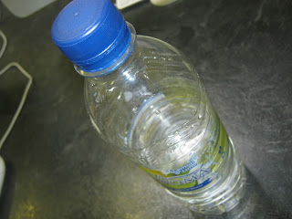
The subject is a water bottle, it is a close-up so it fits in the concept category, I like this photo because it was taken at a different angle, it has plenty of lines and a couple of different textures. The colours match the theme of water. This interested me because I like the angle it was taken from, and I tried to catch the water drops on the bottle too. The subject is clear, there's not much going on in the photo but it is interesting because it gives off a refreshing feeling. People think that this is a good photo but could have been more interesting if there was more going on in the photo.
Compared to this picture of a bottle, my photo has more detail and colour, but this photo has a better background and a little more going on in the photo. I could have improved my photo by having a little bit more going on in the photo, like put it in ice or something.
The subject of this photo is nature, it is daffodil stems and daisies which fits into the exhibition category. I like this photo because there's quite a lot going on in the photo, different colours and also shadows. There are a lot of lines, texture and a mixture of colour. I like the way the stems go to the right. People like this photo because they like the detail but they said there could have been a bit more colour and there could be daffodil heads in this too to make the photo look a bit more cheery.
comparing this photo to my photo, i think that my photo has more detail and better contrast/brightness. I like the daffodil heads in this photo though, I could improve my photo by having the daffodil photos in mine too.
The subject is nature, it is a close-up of a dandelion head which goes in the concept category. I like the detail in this photo and how the fingers and the dandelion stands out and the background is blurred but still green to create a bright, nature kind of theme. The colour is bright, the pink nails add to the image and this photo is positioned in the center. This photo has plenty of lines, a bit of texture and has good quality. People have said they like this photo and think it is my strongest photo because of the colour and detail.
Comparing my photo to this photo, I think my photo has more detail and stands out a bit more. This photo has a dark background, and would a lot better with a light background. I have a light background and I am pleased with my photo.
Subscribe to:
Comments (Atom)


